- August 7, 2019
- Posted by: Tyler Lu
- Category: How-To
Recently, we helped The Odom Corporation move their Intranet to Office 365. Part of the project included customizing their internal Modern Communication site and home page.
This blog post describes how we went about doing the project and includes little tidbits of information related to branding Office 365 Modern Sites that you will not find in official Microsoft documentation.
Note: Modern pages can be enabled on “classic” SharePoint publishing portals by activating the Site Pages feature. However, this is not recommended by Microsoft. You may refer to this post for more details.
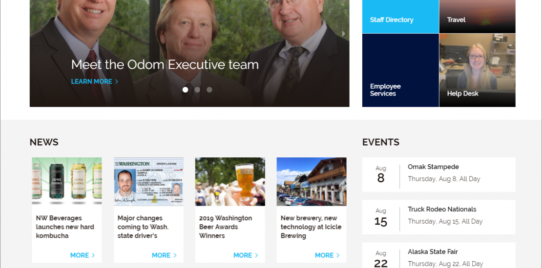
The initial design that we set out to implement
Here are responsive web designs created by our designer.
- Desktop
- Mobile
What you SHOULD NOT DO when branding Office 365 Modern Sites that Microsoft does not say in their documentation
Some posts suggest to use the Modern Script Editor to customize the following elements by applying extra CSS/JS:
- The Office 365 suite header.
- The site header.
- Out-of-box web parts.
The Microsoft engineers we spoke with strongly recommend not to do this, because the HTML DOM of these elements may change. One example is on our tenant, the search box was moved to the suite header recently, but not in another tenant of ours.
Note: The change is not rolled out to the client’s tenant yet. In the last section in this article, you will notice that the search box is still on the site header. For more details, please refer to this post.
How we implemented the header
The Office 365 Suite Header is the official name Microsoft gives to the very top header on the page.
We customized the Office 365 Suite header in the Microsoft 365 admin center. Like this:
- Sign in to Office 365 with your work or school account.
- Navigate to the Microsoft 365 admin center.
- Navigate to Settings > Organization profile.
- Next to Manage custom themes for your organization, click Edit.
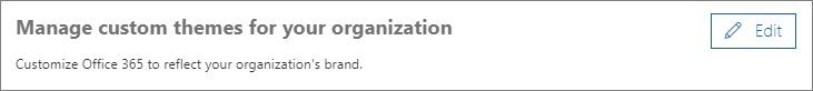
Add a Logo image and a gray Background image, then set Nav bar background color to
#1abaf4. The suite header now looks like this.
- Click Save.
Please refer to Customize the Office 365 theme for your organization for more details.
Site Header
Unlike the Office 365 Suite Header, the Site Header is customized per site.
To customize it, do this:
- Navigate to the site you want to customize.
- Click the gear button > Change the look.
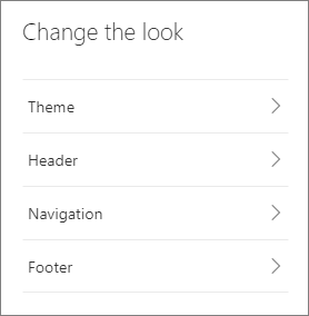
- Click Theme.
- Choose a site theme which is close to your design.
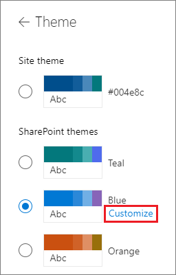
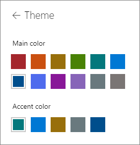
- Click Customize to change the Main color and Accent color.
Click the left arrow to return the Change the look panel.
- Choose a site theme which is close to your design.
- Click Header.
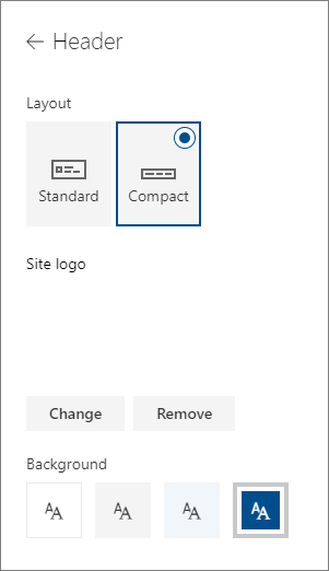
Choose a Layout, change the Site logo and select a Background color. The site header looks like:

Note:
We set a 1 X 1 transparent image as the logo because we wanted to hide the logo on the site header.
We have not determined how to set a background image in this header. - Click Save.
Please refer to Change the look of your SharePoint site for more details.
What we used to implement the footer
As you probably noticed in the Change the look panel, you can customize the footer there too.
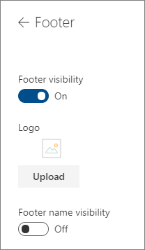
But the out-of-box footer is simple and did not meet our design requirements.
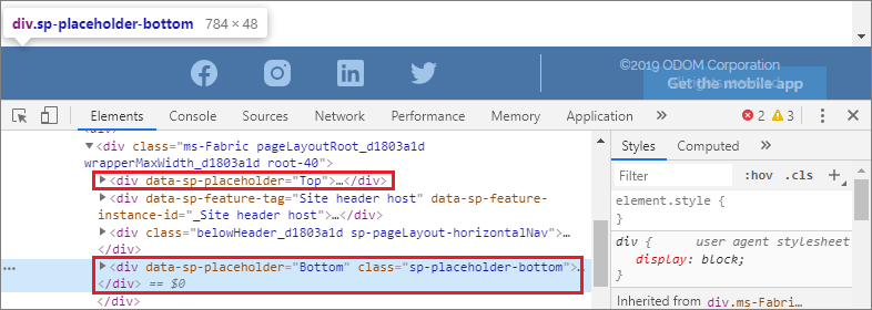
To overcome this limitation, we implemented the footer with an SharePoint Framework (SPFx) Application Customizer – a SharePoint Framework extension type. With Application Customizers, we can get access to the Top and Bottom page placeholders in the DOM, then add custom HTML elements.
The official getting started article is a good tutorial for you to understand how to use SharePoint Framework Extensions.
Note:
We used React components in the Application Customizer we created. Please refer to this post to learn more about it.
Keep in mind, there is currently an open issue that affects the footer in mobile viewports – Application Customizer footer not rendered correctly on mobile.
What we used to implement the custom web parts
As we mentioned above, applying custom CSS to the out of the box web parts to make them match ur design is not somethign that is recommended. It is a fragile approach that could break at any moment.
We created custom SPFx web parts by running the running the Yeoman SharePoint Generator, it prompts to select a framework:
? Which framework would you like to use?
  No JavaScript framework
> React
  Knockout
We used the React framework to implement the custom web parts.
How negative pixel margins were used to eliminate spaces
On the design, the second section (or row) is filled with gray background color.
On the page edit section panel, we could not found the same color, so we chose a close one.
Then we used the color as the background color of the two web parts that should be added to this section.
However they did not look as good as we expected after they were added to the page – they were surrounded by white spaces. You can see this below.
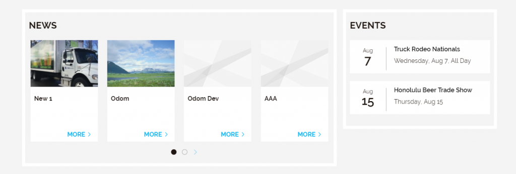
This is because SharePoint adds some padding and background styles around the web parts.
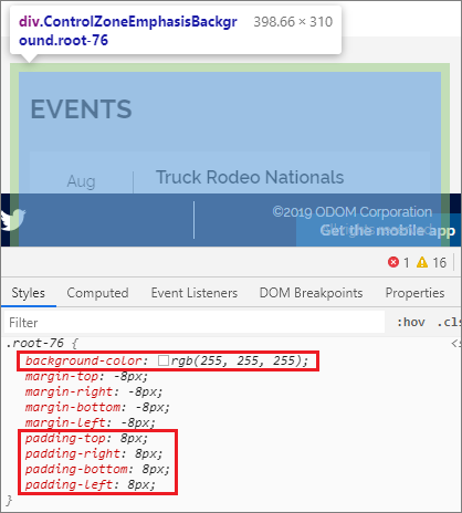
We solved this by using negative pixel margins on the outer-most DIV in our web parts:
margin: -8px;
We also used the same amount of padding to counterbalance this:
padding: 8px;
We did not use this approach for the carousel and tiles web parts, because there are several levels of spaces to eliminate.
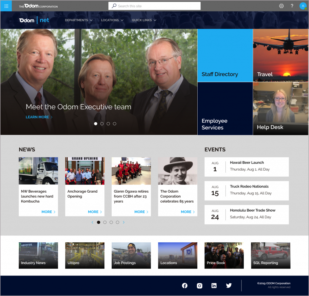
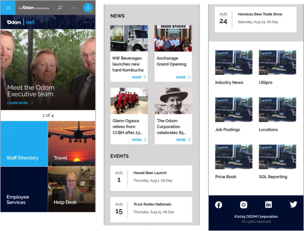
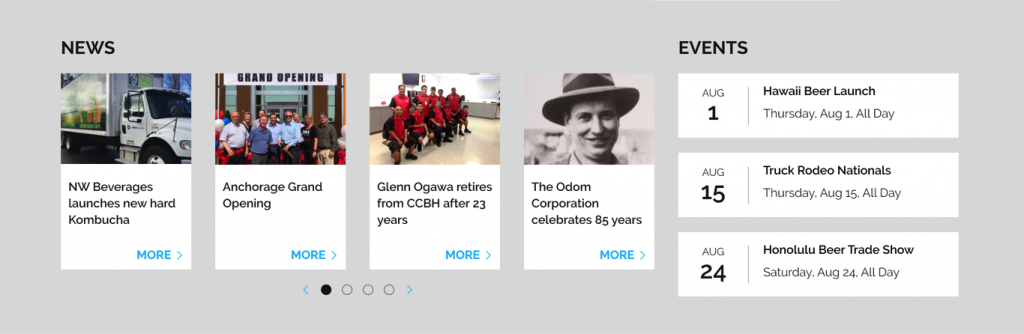
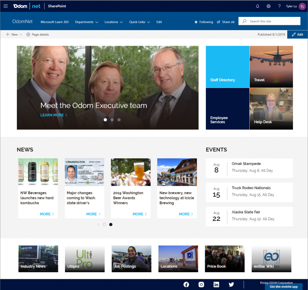
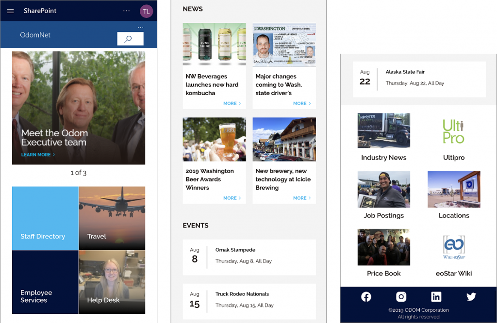
What the final design looked like after it was implemented
Below are the final views of the home page:
- Desktop
- Mobile
You may have already noticed several differences between the final views and the initial designs. These are trade offs you may also need to make in your own Office 365 Modern Sites designs.
- The Office 365 Suite Header: We did not fully follow the initial design, and during the project it was decided to use another logo and a different background color.
- The Site Header: At this point, SharePoint does not provide us options to customize the site header in depth. Therefore, we could not set the background image.
- Position of the search box: an update has rolled out to our tenant, but not to the client tenant yet.
- Space around the carousel and tiles web part: we used negative margins to eliminate the spaces.
- The footer: we reduced the footer height.